Maverick Sales
Identity & Communications
Key Takeaways
I have a unique, intuitive understanding of business identity.
I'm fluent in "Client."
My work is steeped in design history.
Initial Brand Development
2018: a young, brilliant executive had just broken away from a directorship at Kraft Heinz looking to make his own mark on the CPG space. He had heard another client rave about my work, and hired me to design an identity for his startup.
My early career had little relevance to the creation of a serious, corporate, brand identity, but I was hungry to try my hand at it. I didn't think twice before accepting the contract.
Ever since I found a copy of an extremely rare design reference at a thrift store as a nine-year-old, I've been deeply inspired by American corporate brand identities of the 1950s and 60s. I love the timeless and nonrepresentational design of that period. I wanted so badly to make work that Yasaburo Kuwayama would appreciate.
Initial Concepts for MAAV logo.
Final Logo for Initial MAAV Inc. branding project. 2018
Client Keywords:
Minimal, abstract, corporate, trustworthy.
The issues with the final brand were apparent from the beginning. I noted these in meetings, and suggested constructive ways we could turn those weaknesses into strengths.
Over time, the client started to refer to this issue as "The Opacity Problem." When I returned to the brand a few years later, that was the primary pain point.
"How can we communicate what our company does? How can we be a little more personal, while still being professional?"
First up: change the name. The original brand name, MAAV, is a noble and impenetrable acronym. It stands for the names of the founder's wife and children.
I think of brands like this as talismans: they're good-luck charms that hold spiritual weight for their founders, but they don't necessarily serve the company as well as a more descriptive name might.
Coupled with a fully nonrepresentational logo, it led to a lot of initial questions from their prospects, during the absolutely critical first-30-seconds handshake period. No good.
Final Maverick Sales Logo
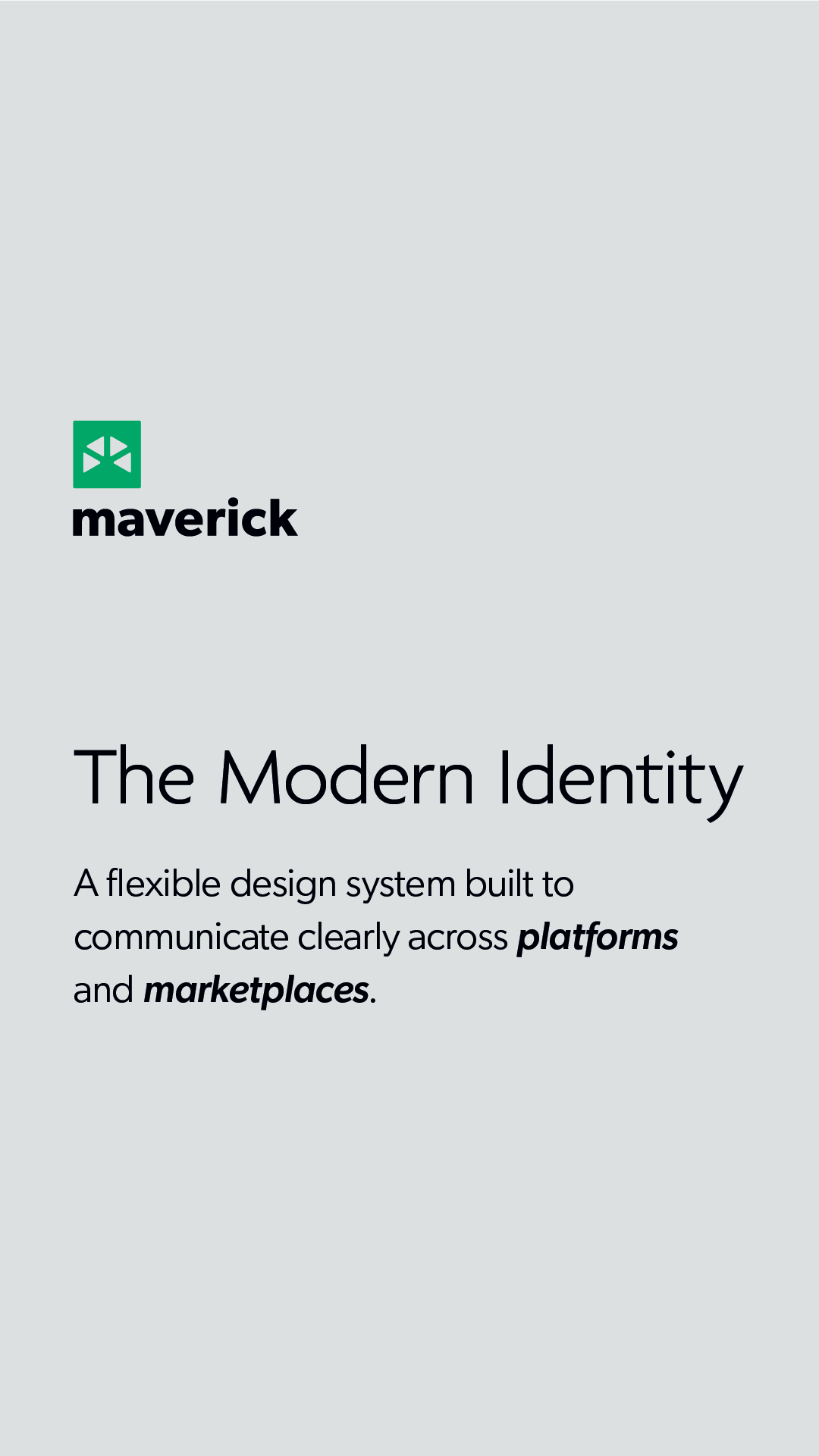
"Light Mode" Type Styles
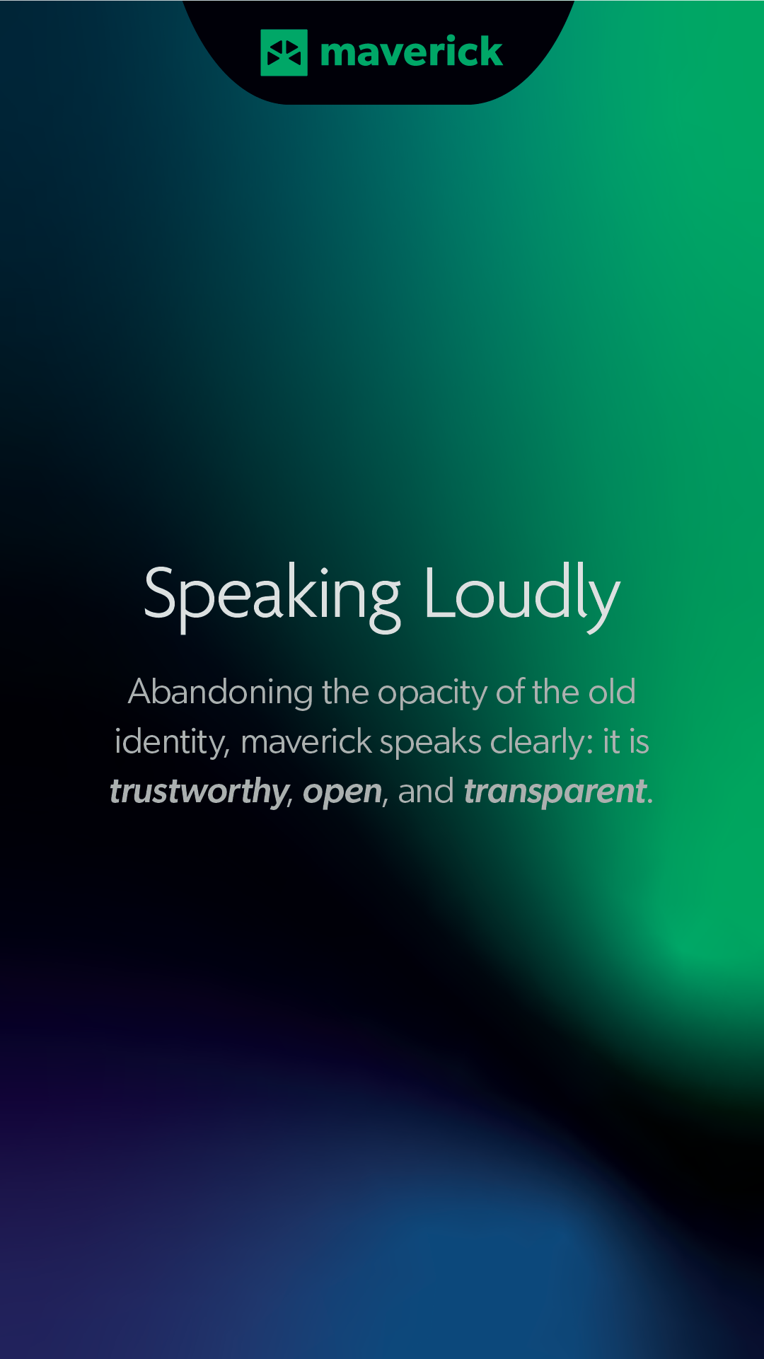
"Dark Mode" Type Styles & Brand Gradient
Second: the colors. I'll admit fault—a pure RGB blue looks fantastic on screens, but it's damn hard to match consistently in print. Junior mistake from early-20s me.
The client and I decided we wanted to be more colorful, to support illustration and animation in our B2B marketing system, to have more coherent brand guidelines, and to have a brand that would be critically identifiable across different platforms.
The brand update moved forward.
Step Three: a website that communicates.
The most important points on the website were centering the point of first contact with the team.
Why?
Because the total audience size for the site was small.
I calculated the total number of people who could have decision-making power or influence within the CPG market. Then, I targeted them with precise LinkedIn ad campaigns, thought leadership content, and email marketing.
I treated every page on the site like an optimized landing page for a specific type of client.
Final Thoughts
It's so satisfying for me to see a brand I designed be attached to a company with such skyrocketing growth. Maverick is a remarkable organization with a remarkable team. I feel deeply lucky and grateful that I got to learn so much from them.
I hope that the tools I made serve them well, for many years to come.
